Wayfind

Web app

Background

Group travel should be one of the most exciting things to plan. In reality it's one of the most stressful. The itinerary lives in one person's head. Costs are tracked in a spreadsheet nobody updates. Decisions get buried in a group chat already full of memes and unrelated conversations. The person who cares most ends up doing everything while everyone else contributes opinions without accountability.
Wayfind is a collaborative group travel planning web app designed for the reality of planning trips with friends, the coordination layer that happens after you decide to go and before you leave.

Problem

No platform is built for the cover song journey. Spotify and Apple Music are built for passive consumption. YouTube gets closer, but covers compete for space with tutorials and vlogs. There's no dedicated space for cover culture, no way to trace a song's lineage.The problem isn't just that covers are hard to find. It's that music has hidden layers: history, lineage, connection across generations and no platform is built to surface them.

The Users

People planning trips with friends or family, 2 to 6 people, mixed levels of organisation, at least one person who naturally takes the lead but doesn’t want to carry the entire burden alone.

The Process

The project started with research before any design decisions were made. Mapping the competitive landscape first, understanding where Google Travel, TripIt and Wanderlog each fell short, it meant the problem definition was grounded in what actually exists, not assumptions about it. The gap became clear quickly: the social reality of group travel was completely unaddressed.

From there, a full UX document was built before touching Figma. Problem definition, user profile, feature scope, information architecture. The goal was to resolve the thinking on paper so the design work could focus on execution rather than second-guessing fundamentals mid-process.
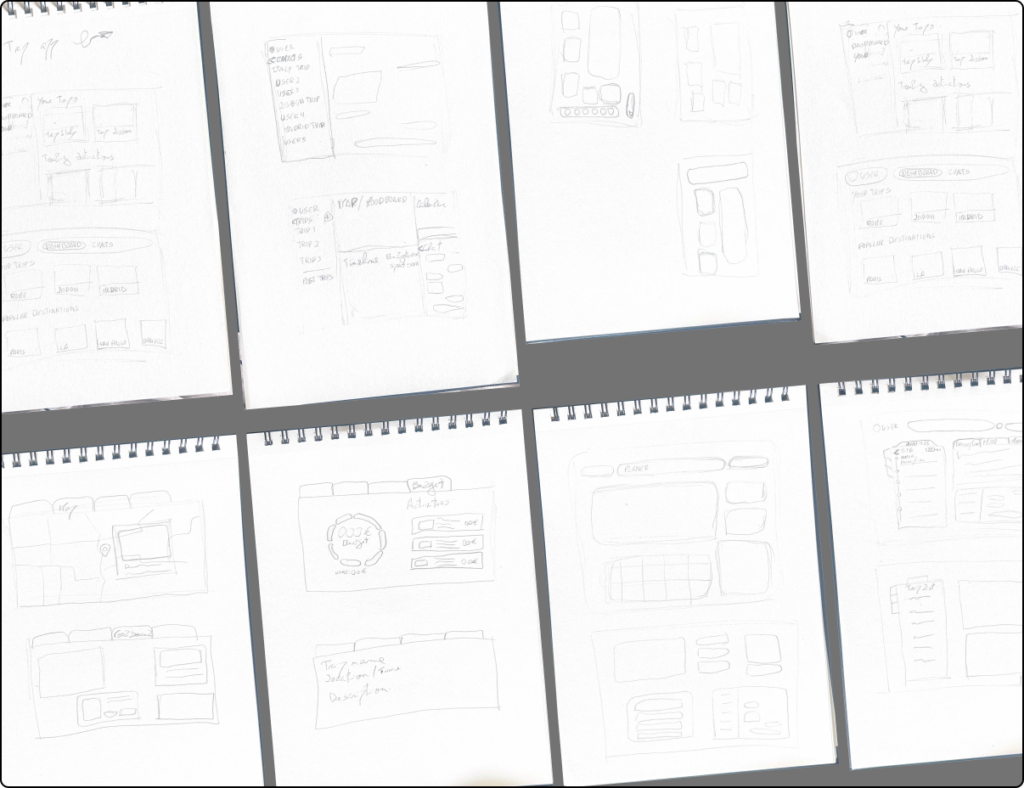
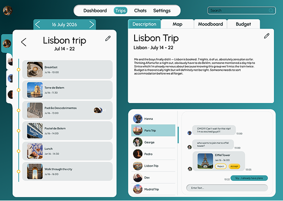
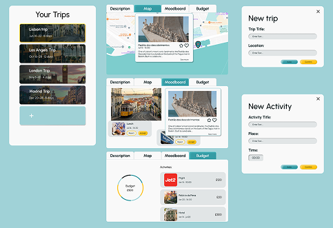
Wireframes came next and this was the most iterative phase of the project. The core structural challenge was holding individual and group views simultaneously without creating confusion. Getting that relationship right took significant iteration. How the two timelines coexist on screen, how an activity moves from idea to confirmed plan, how the dashboard communicates across multiple trips at once, none of it clicked immediately. The wireframes went through several rounds before the structure felt honest to how group planning actually works.

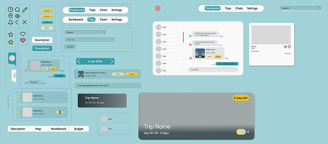
Once the structure was solid, a design system was built before a single final screen was touched: colour, typography, components. That discipline paid off. By the time final screens were being designed, the decisions were creative rather than repetitive.

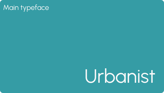
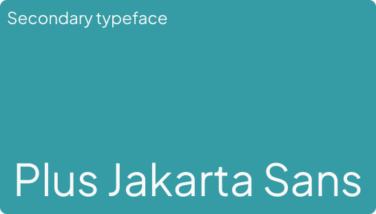
Design System

Individual and group timelines as separate but connected layers.

Each member builds their own timeline: arrival, departure, accommodation, personal plans. Visible to the group but owned by them. The group timeline isn’t imposed by one person, it emerges from the bottom up as plans overlap and activities get confirmed together. This reflects how group trips actually work.

A two-stage activity proposal system.

A group activity goes to a poll and needs collective consensus. An open invitation is personal first, “I’m doing this, who wants to join?”, with no pressure or formal vote. The distinction respects individual autonomy within the group without making it awkward.

A notification feed that combines action and awareness.

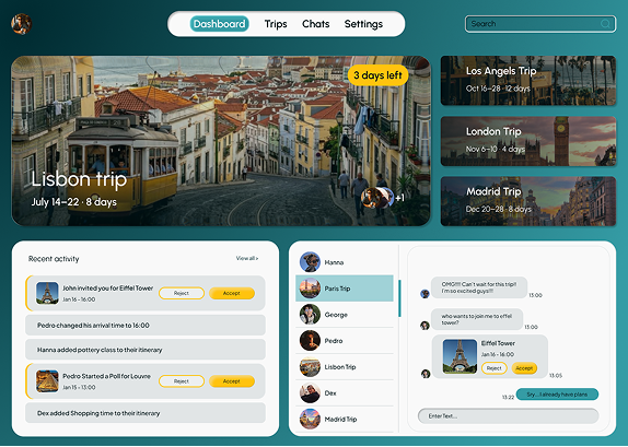
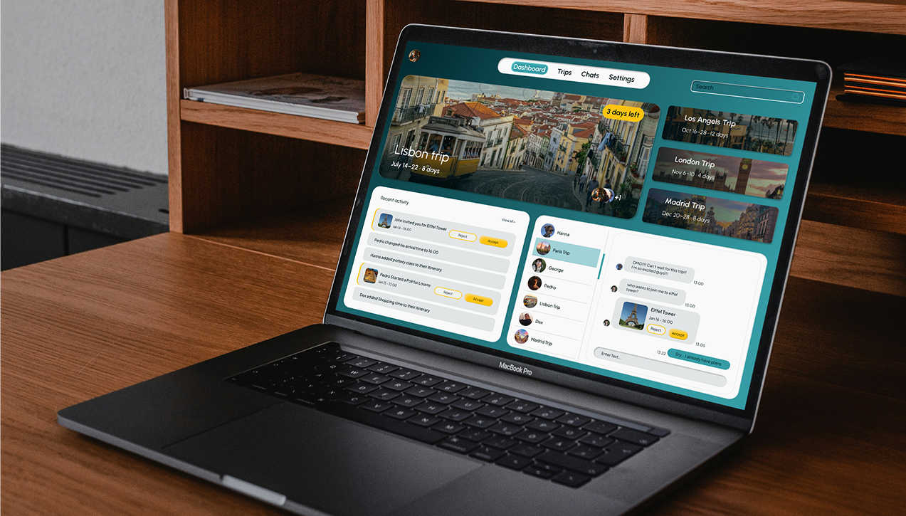
Actionable items, polls waiting for your vote, invitations waiting for your response, sit alongside passive updates, Pedro changed his arrival time, Hanna added a pottery class. Together they create the feeling that the trip is already happening before you leave.
Budget as a live shared view, not end-of-trip admin
Costs are added as they’re confirmed, tagged as shared or individual, visible to every member from the moment they’re added. The goal is to replace bill shock with ongoing transparency.

Contextual chat tied to planning.

Activity proposals appear inside the chat as interactive cards, accept or decline without leaving the conversation. This reflects how group planning actually starts: a chat that gradually turns into an itinerary.

Reflection

Wayfind was the most conceptually complex of the three portfolio projects and the one that pushed my design thinking the furthest.
The biggest lesson was the difference between designing by intuition and designing with a clear user flow in mind. Early on I was making visual decisions before fully resolving the core mechanics. Resolving the thinking first made every subsequent decision more confident and more defensible.
The two-stage activity proposal system feels intuitive in the design, but would need usability testing with real groups to confirm the language and interaction model lands without explanation. That’s the clearest next step.
The mobile companion app is the obvious next phase. Group travel planning happens in bursts, and the social, reactive moments belong on mobile. The desktop-first approach was the right call for the planning layer. The rest belongs elsewhere.

Diogo Fernandes

Let's build something worth using.

All Rights Reserved